Humanities Program at Providence College
Logo Design | Brand Refresh | College Marketing

THE
BACKSTORY
Providence College’s Humanities Program is not a lecture hall snoozefest. We’re talking a classic way to get a college education: smart, spirited and unmistakably Catholic. Prospective students needed to see it, feel it and really want it. Basically, we needed to stop a 17-year old in their tracks and make them say: “Okay, this looks like my kind of place.” They needed branding that could capture its sense of mission, tradition and excitement.

WHAT
WE DID
We designed two new logos:
- The Star: An eight-pointed emblem honoring the Catholic and Dominican roots that give this program its soul.
- The Bust: A stylized portrait of St. Dominic, giving a nod to tradition while feeling fresh and modern.
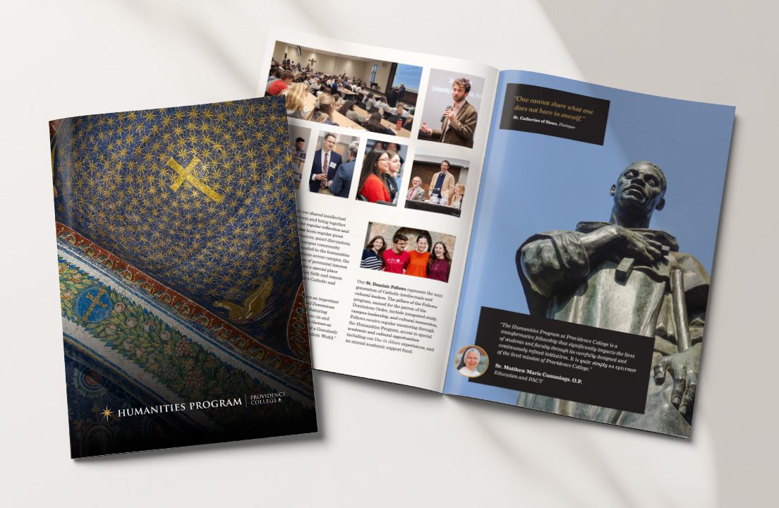
We also designed a viewbook: a mini guide that lets students see, feel and imagine life in the Humanities Program.

WHY IT
WORKS
Gen Z responds to branding that feels authentic and meaningful. The new branding hits that sweet spot:
- Modern yet timeless: A design that nods to history without feeling old-fashioned.
- Clear and bold: Recognizable at a glance, whether on a website, social media, or campus poster.
- Purpose-driven: Every element speaks to the mission and values of the Humanities Program.


THE
RESULTS
Fresh logos and a beautiful view book have helped make the Humanities Program a big man on campus.
What could have felt like “meh, just another major” can now be seen as a program that enriches young minds and prepares them as future leaders and all-around good people.
And the branding doesn’t just attract students. It gives the Humanities Program a stronger sense of identity as they elevate their presence in the campus community.


READY TO STAND OUT IN THE DIGITAL SPACE?
Let’s give you a design that elevates your Catholic identity and grows your loyal audience base. First, tell us about yourself.
OTHER STORIES
OF SUCCESS
Chesterton Academy
SEE HOW WE DID IT
Byzantine Catholic Eparchy of Passaic
SEE HOW WE DID IT